This article is one of a series of SuperMail articles by Colin Grenfell, who is a superannuation consultant and actuary and Associate Director of SuperEasy.
Each article compares the long term performance of two investment sectors, such as Australian Shares, International Shares, Listed Property or Fixed Interest, or financial indicators, such as the Consumer Price Index (CPI), Average Weekly Ordinary Time Earnings (AWOTE), 90 day Bank Bill Rates or 10 year Bond Rates.
This article compares the investment performance of a "Cash" portfolio with rates of inflation over the 24 years from 31 December 1979 (this being about the time when suitable Cash sector data first became available) to 31 December 2003.
For this article, inflation has been measured as the rate of increase in the Consumer Price Index (CPI).
The Cash sector comprises investments held in cash and other short-term interest-bearing securities. It has been assumed that investment income during the whole 24 year period has been subject to tax at the15% superannuation tax rate (even though in actual fact the 15% tax was not introduced until 1988).
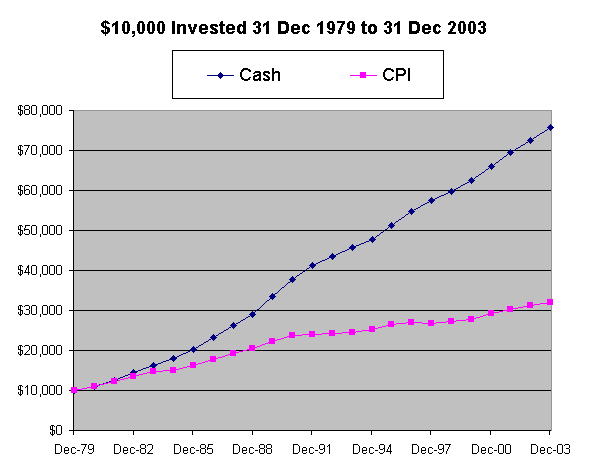
First let's examine what happened if $10,000 was invested at the start of the period, assuming that all investment income was reinvested back into the Cash sector. For comparison the CPI starting from a base of $10,000, is also shown.

The next table summarises the results:
|
$10,000 invested for 24 years from 31/12/1979 to 31/12/2003: Accumulated to: |
Cash
$75,700 |
CPI
$31,900 |
Difference
$43,800 |
|
|
Average annual compound return (net of tax): |
1st 12 yrs 2nd 12 yrs 24 yrs |
12.55% 5.18% 8.80% |
7.59% 2.39% 4.96% |
4.96% 2.79% 3.84% |
|
Inflation as a percentage of the net of tax investment return |
56.3% [ = 4.96% / 8.80% ] |
|||
Source: Austmod historical returns net of tax

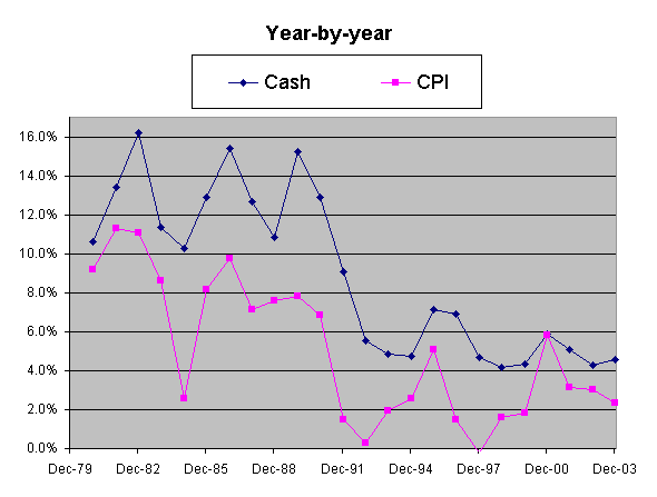
In the year ending 31 December 2000, the annual return for the Cash sector was 5.8% net of
tax.
In that year, inflation averaged 5.9% due primarily to the introduction of GST from 1 July 2000.
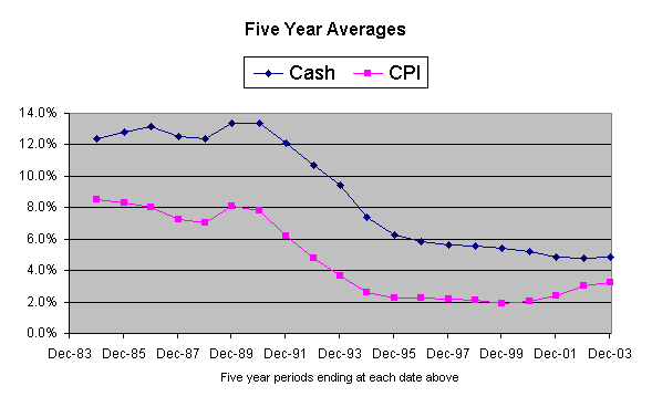
To give an indication of the trends in investment return and inflation over the period, the
next chart plots the five year moving average compound returns per annum:

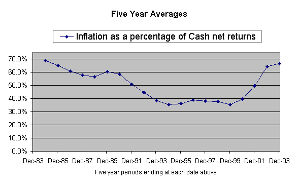
The next chart plots inflation as a percentage of the Cash sector net of tax investment return
and is also based on five year moving averages:

Disclaimer: